Well apart from the crazy season where 'reliable sources' and unnamed club officials are apparently telling journalists that player 'A' is joining Bayern Munich from MK Dons or player 'B' is joining Man United from the Red Lion pub team...or Liverpool as the case may be with their recent results...there is one thing I personally enjoy during these long boring football free months - the unveiling of club jerseys. Of course United's has been leaked and we apparently can look forward to 12 newly designed home shirts if the internet blogs are all to be believed but until it is officially unveiled we can have a brief look at some other clubs new shirts for the 2015-16 season.
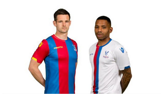
Crystal Palace - two new shirts to glare at, home seems to have chunkier stripes than normal but is the usual design, not as appealing but everytime I see that strip I remember the tears of Suarez and it fills me with such joy. The away strip features two vertical stripes that go quite well with the white away shirt.
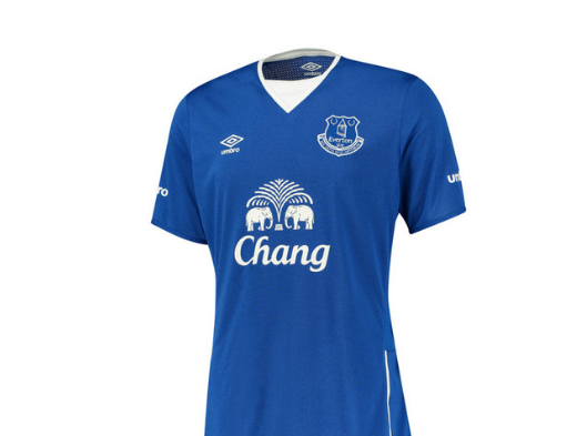
Everton - Home shirt that has echo's of the mid 80's shirt when they were top dogs of England, let alone Merseyside. Apparently the clubs latin moto is on the back which is a nice touch but all in all nothing to be excited about as it appears to be quite a plain shirt.
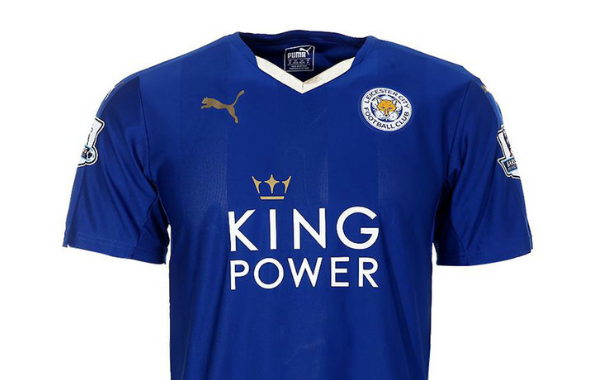
Leicester City - Having secured their top flight status they have released quite a nice shirt, the crest and makers logo seems a little high but with the barely see-able vertical stripes it looks quite nice. I'm not really a fan of Puma as their shirts tend to hug the body too much but this one seems to not be in that mould.
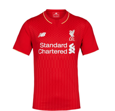
Liverpool - Okay, okay I am biased here and I despise this club. However this shirt if I am honest is vile. While I do think the old Liverpool crest is better than the monstrosity they have been using the past decade the shirt itself is almost if not, as bad as United's tea towel design. Only Liverpool's design especially at the bottom of the shirt resembles the bottom of the World Trade centres...google image it and see for yourself. Please don't tell me the bin dippers are trying to associate themselves with 9/11?
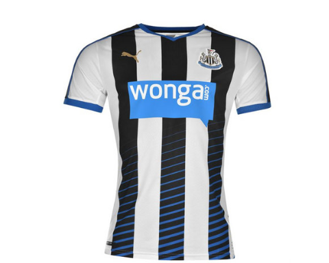
Newcastle United - Home shirt that sticks to the traditional black and white stripes, however Puma to their credit have tried to spice it up with touches of blue around the collars and arms. The blue stripes fading as they rise also tend to add something different. Nice touch.
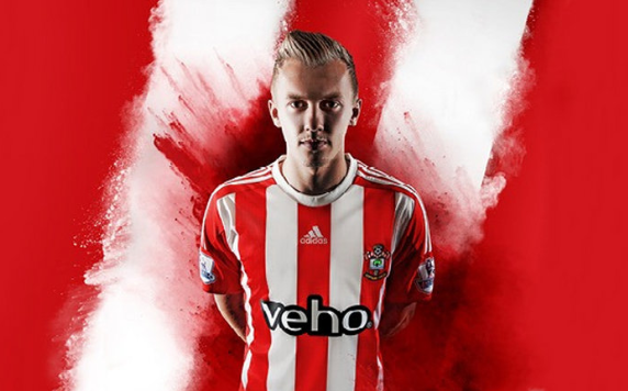
Southampton - As with Newcastle, Southampton's designs tend to be restricted to tradition. Adidas have tried by moving their logo into the centre and they apparently say the white collar is to represent a Halo...because of the 'Saints'...yeah...nice shirt but too Stoke City for me.
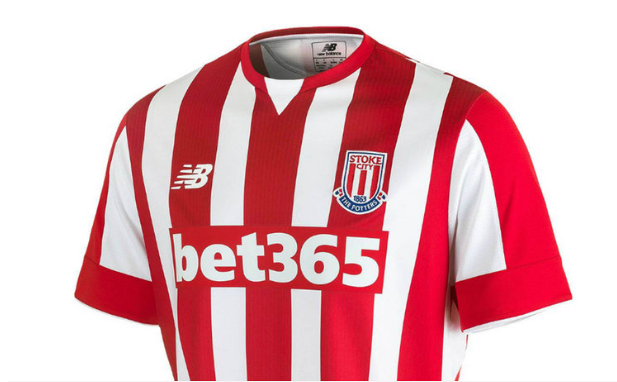
Stoke City - Speaking of which...New Balance have gone for a plain shirt with no thrills to kick off their deal with Stoke. The collar is far better than Southampton's and it is a nice crisp shirt. After the hash of the Liverpool shirt it seems that new Balance can design decent shirts...
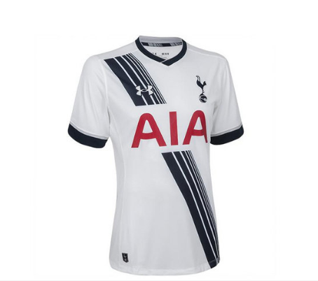
Spurs - Last season Spurs were run over by a United juggernaut about to hit the road hard before we turned over the bin dippers at Anfield...and apparently we left a tire mark on their shirt! Under Armour have made a nice shirt, nice collar and plain 'cuffs' but the 'tyre mark' doesn't seem to tie in for me. Love the red sponsorship as I know some Spurs fans get angry at having red on their shirt...yeah...I can understand City fans not liking a red and black away shirt but moaning about the colour of your sponsors writing?
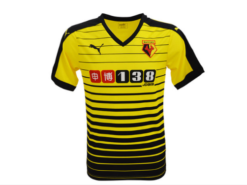
Watford - Oh dear God where do I start? Hideous and surely it is more fitting fora rugby league side? Apparently it is the first Watford home shirt to have stripes in a century...and boy doesn't it look 'swell' with a thick black trim? Puma, what have you got against Watford???
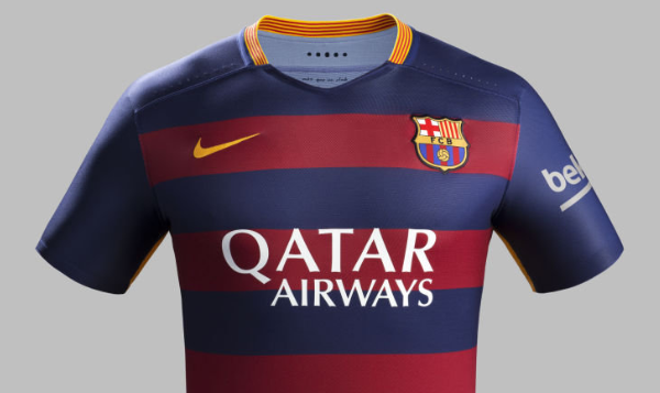
Barcelona - It still seems weird to me seeing a sponsor on a Barca shirt, I did admire them for taking that stance that no company is bigger than their club...but times change, and so does their vertical stripes that become horizontal. They have taken different paths to their traditional stripes before and this one works too, nice and crisp and the collar also looks good. It's just a shame that Suarez will soil it by biting someone while wearing it...mark my words it is 'inbred' in the man...
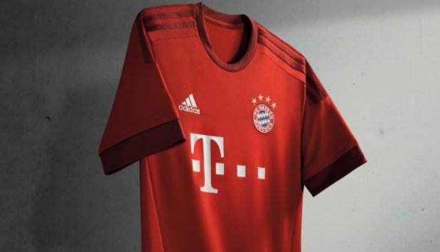
Bayern Munich - Gone are the red and blue stripes and they have returned to an all red strip for the 2015-16 season. Just can't put my finger on it but it is just horribly plain, dull, boring yet efficient...so typically German.
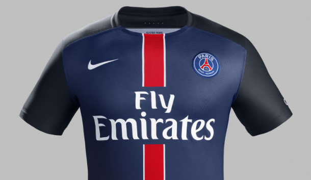
PSG - It seems Nike have stolen the same template for the arms from Barca or they couldn't be bothered to do anything different. Baring the red stripe down the centre it is what it is, nice to look at but once you have acknowledged the stripe your viewing pleasure is over. Can't help but see Di Maria's wearing that next season...
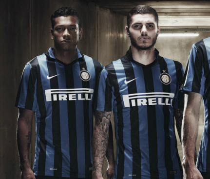
Inter Milan - Traditional black and blue vertical stripes, nice...and that's about it.

 RSS Feed


